Fit & Pro
Elevating Fit & Pro: The Logo Evolution
Scope: Brand Identity | Brand communication
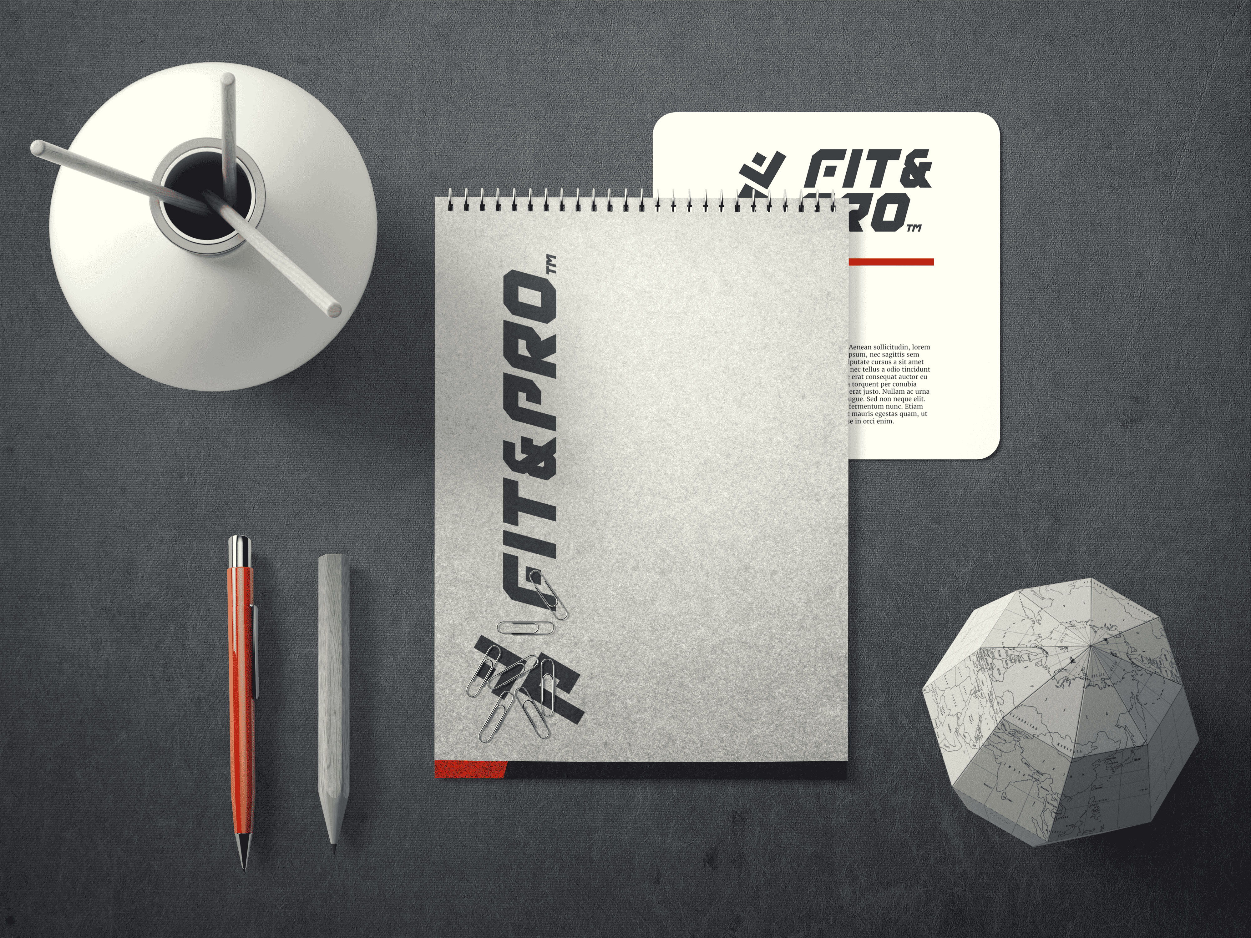
Refined Iconography
In our quest to rejuvenate Fit & Pro’s brand identity, we embarked on a journey of refinement. Our mission was to breathe new life into the existing icon while staying true to the essence of the brand. We meticulously adjusted the angle of the icon, aligning it with the natural curve of a runner in motion. The result? A dynamic fusion of form and function that captures the spirit of athleticism.
The Runner's Silhouette
At the heart of the logo redesign lies a harmonious blend of form and symbolism. By seamlessly intertwining the letters “F” and “P,” we sculpted the silhouette of a runner, poised in mid-stride. This visual metaphor pays homage to Fit & Pro’s commitment to fitness and also serves as a powerful emblem of endurance and determination.
Typeface Transformation
To complement the revamped icon, we introduced a bespoke typeface: “Fipro Sports.” Inspired by the energy and vitality of the Fit & Pro athlete, this custom font exudes dynamism and movement. With its bold strokes and sleek contours, “Fipro Sports” reinforces the brand’s core message—that within every individual lies the heart of an athlete, ready to conquer any challenge.