
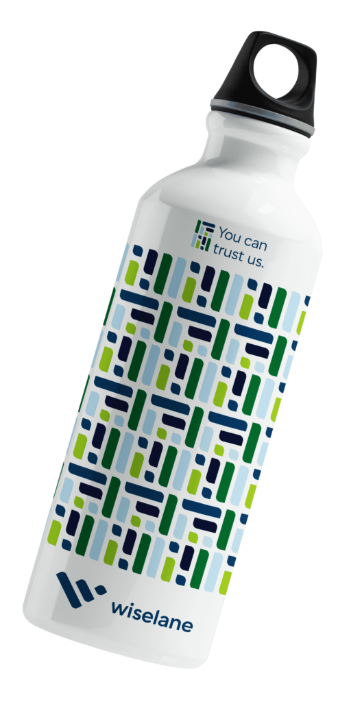
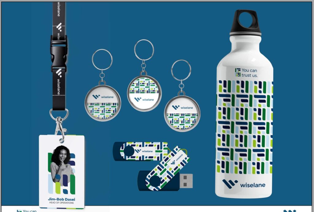
Wiselane
How do you blend sophistication with approachability to build trust?
Scope: Visual Identity | Logo Design
When Wiselane entrusted us with their brand, we knew we had a unique challenge ahead. How do you blend the sophistication of finance with the approachability that builds trust?
Drawing inspiration from the heartbeat of finance—the bar chart—we embarked on a journey to craft a logo that would not only symbolize Wiselane’s expertise but also resonate with their audience on a personal level.
The Birth of the 'W'
As we twisted and turned the bar chart, a letter emerged—a bold, confident W. It was more than just a design; it was a visual representation of Wiselane’s capacity and commitment to their clients.
Approachable Sophistication
With clean lines and a modern aesthetic, Wiselane’s logo became a beacon of approachable sophistication. It was a subtle nod to their expertise, yet it exuded warmth and accessibility.
A Trustworthy Emblem
Wiselane’s logo wasn’t just a symbol; it was a promise. A promise of trust, reliability, and integrity in the world of finance. It was a statement to their clients: “We’re here for you, every step of the way.”